
Project Overview
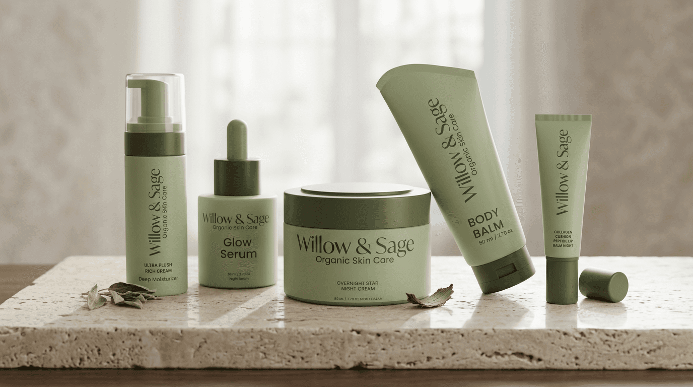
Willow & Sage creates small-batch, plant-based skincare products using ethically sourced ingredients and eco-friendly packaging. They approached me to develop a new brand identity that captures their artisanal craftsmanship while appealing to a design-conscious, wellness-oriented audience. The goal was to establish a cohesive visual system that could flex across packaging, digital touchpoints, and social media all while communicating the brand’s core values of purity, sustainability, and serenity.
SERVICES
Branding
Logo, Packaging System,
Visual Identity
INDUSTRY
Beauty and Personal Care
View Project

The Challenge
The organic skincare market is heavily saturated with “natural” branding that often feels generic, muted greens, leafy illustrations, and handwritten fonts. The challenge was to differentiate Willow & Sage by creating an identity that still felt organic and grounded, but with a modern, elevated twist. Balancing warmth and minimalism was key, we wanted a visual system that felt human and hand-crafted, yet premium and timeless.ove both its physical and digital presentation, thereby boosting sales and customer engagement.
The Solution
To address this, I developed a visual identity built around three design pillars: Organic Roots, Mindful Rituals, and Modern Calm. Logo System: A minimal wordmark with subtle serifs and generous spacing, inspired by vintage apothecary labels but refined for modern use. Color Palette: A soft, earthy mix of sage green, sand, and warm neutrals, balanced with rich brown and cream tones to evoke calm and purity. Typography: A pairing of an elegant serif for sophistication and a clean sans-serif for balance and readability. Brand Elements: Embossed textures, organic shapes, and botanical-inspired layouts to create depth and tactility. Packaging & Social Design: Clean, modern compositions that highlight natural materials, emphasizing sustainability and wellness without clichés. The result is a brand system that feels authentic, elevated, and soothing,a reflection of the brand’s mission to bring nature’s serenity into everyday skincare rituals.


The Results
The rebrand successfully transformed Willow & Sage into a cohesive, premium wellness brand. The new identity feels refined yet approachable, instantly recognizable, and emotionally resonant with its target audience. Across packaging, social platforms, and print, the brand now communicates consistency and confidence, positioning Willow & Sage as a trusted, sustainable choice in the clean beauty space.

